Every successful brand begins with a strategically designed logo. We create timeless visual marks that communicate trust, recognition, and long-term business value.
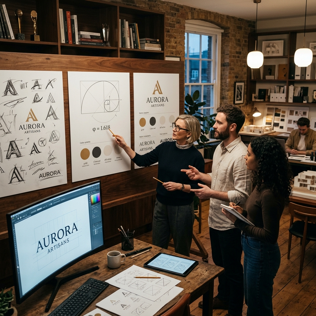
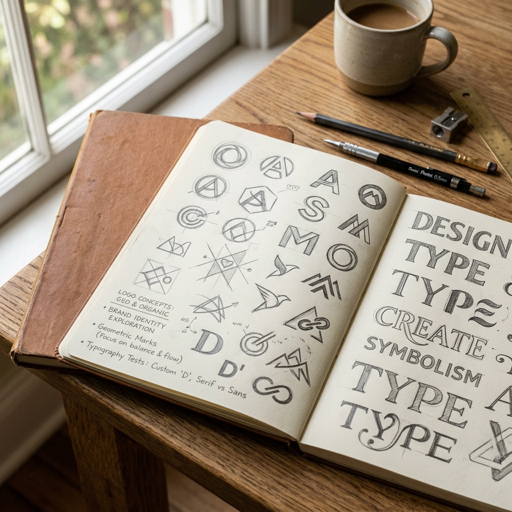
A logo is the single most visible element of a corporate system, serving as the neural anchor for customer impressions and value recognition.
Allows customers to identify your product instantly on crowded retail shelves or digital feeds.
Establishes corporate authority and signals professional scale, building consumer buy-in.
Encapsulates complex brand narratives into a single clean mark that reads instantly.
Creates an immediate neural association in consumers, keeping you top of mind.
Works flawlessly at 16px on mobile screens and across massive physical billboards.
Resists short-lived visual trends, remaining relevant for decades without dilution.
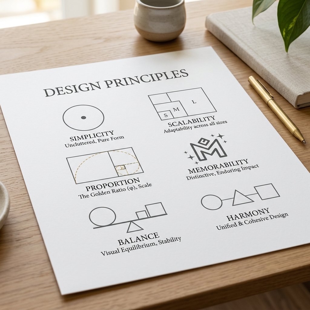
Explore the core mathematical and strategic principles behind professional brand mark development.
We design across all primary mark categories. Choose a category below to explore details, target application cases, and layouts.
A typography-focused signature logo utilizing custom-crafted, clean letterforms.
An initials-based monogram icon forming a highly balanced geometric glyph mark.
An isolated symbol, icon, or graphic device that translates brand identity without text dependency.
Unified layout locking a custom symbol and typography together in a geometric ratio.
Traditional crest seal locking custom typography and symbols inside a distinct geometric shield shape.
A custom illustrated character ambassador designed to build brand friendliness.
A timeless logo is born from strategic positioning, competitive whitespace calculations, and rigorous brand alignment.
Map competitor colors to isolate whitespace channels. Avoid blue-saturation in tech spaces.
Explore high-contrast serif lockups against geometric curves. Opt for custom kerns (+0.12px).
Identify core corporate values and translate into geometric symbols (circles = connection, triangles = progression).
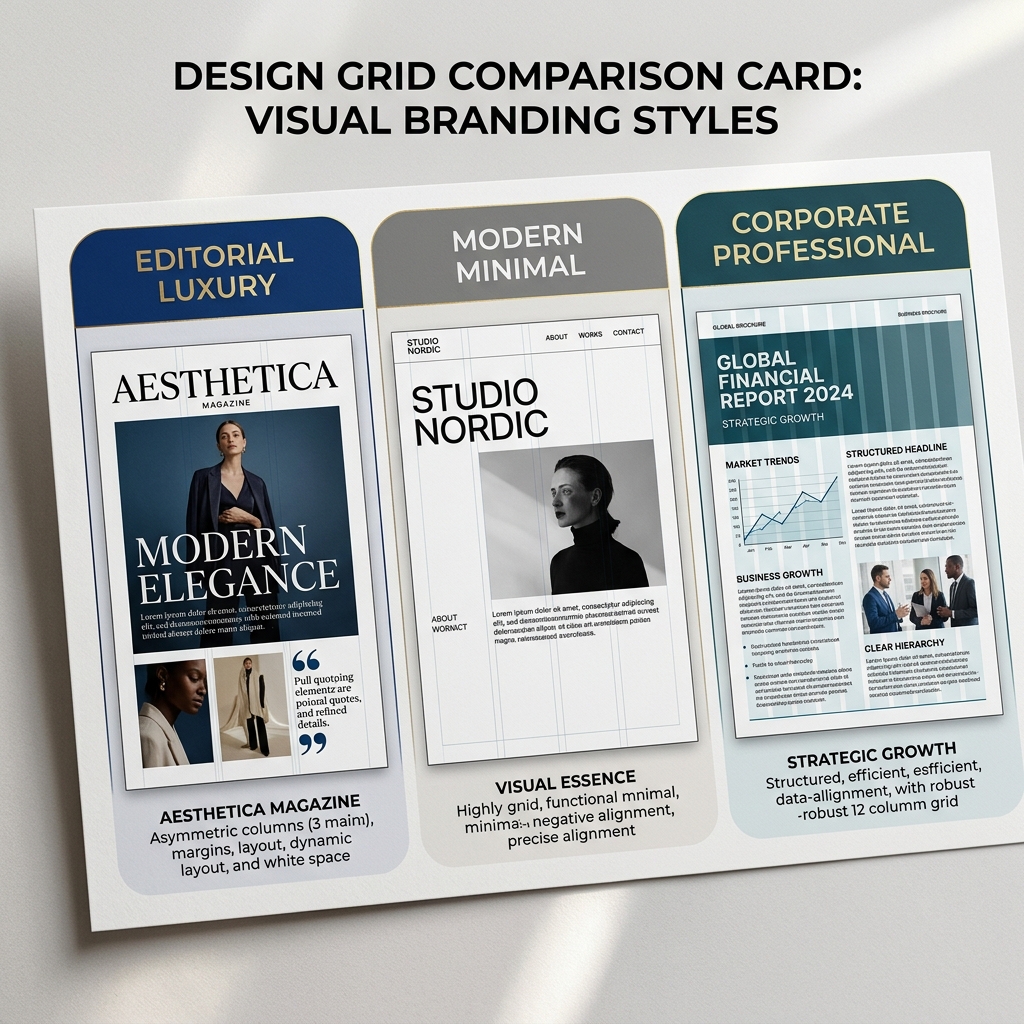
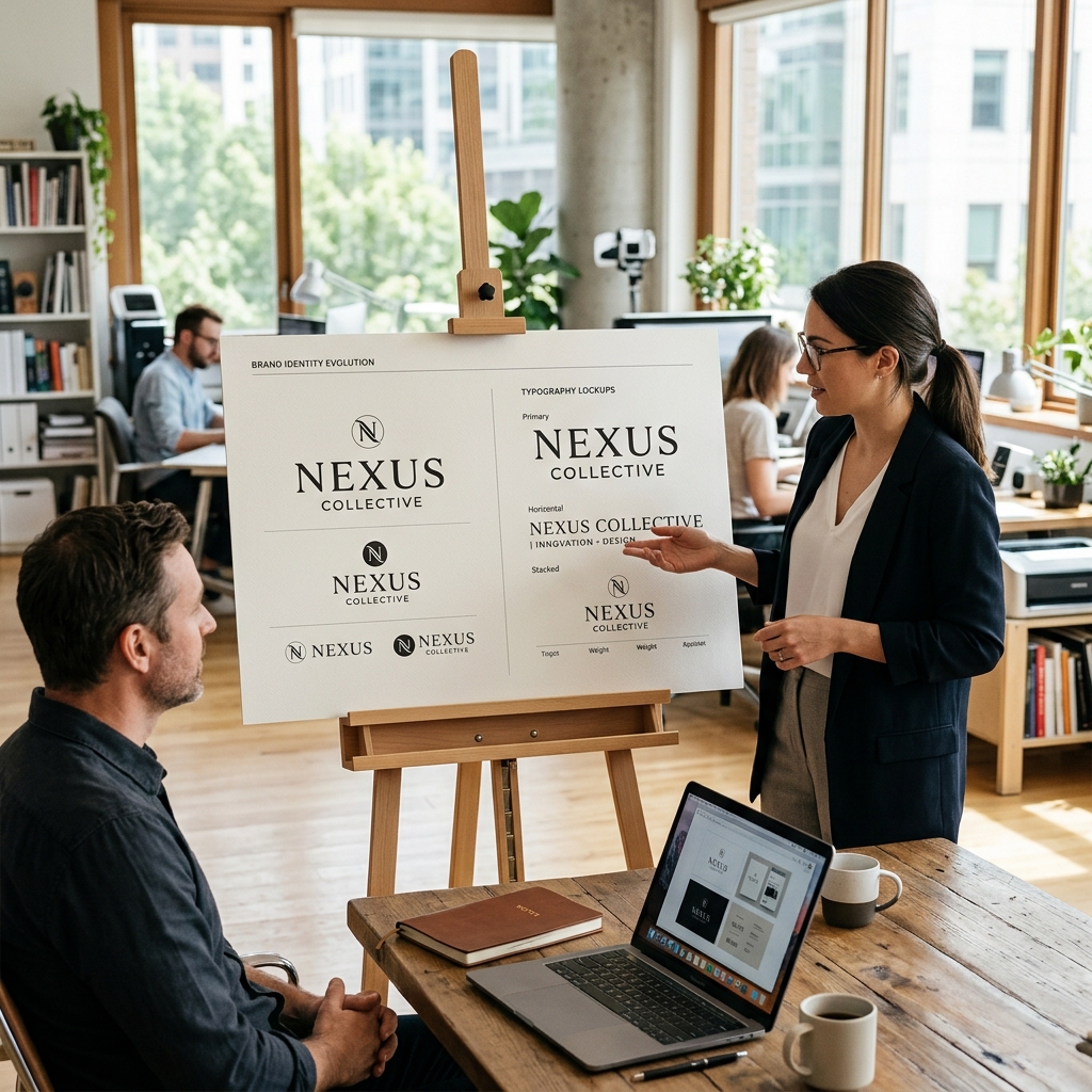
Witness the strategic evolution of a signature mark, moving from the initial raw pencil draft to mathematical curves and final mockups.
Raw ideas sketched freely on paper to explore marks.
Converting outlines to geometric vector anchors.
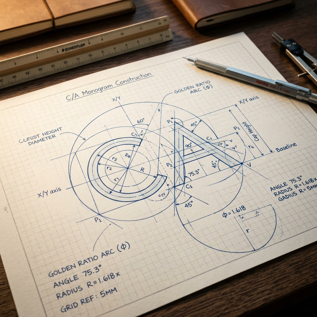
Applying Golden ratio boundaries and tangents.
Adjusting curves for optical balance and scales.
Exporting clean curves, colors, and typographies.
Rendering the logo on actual physical touchpoints.
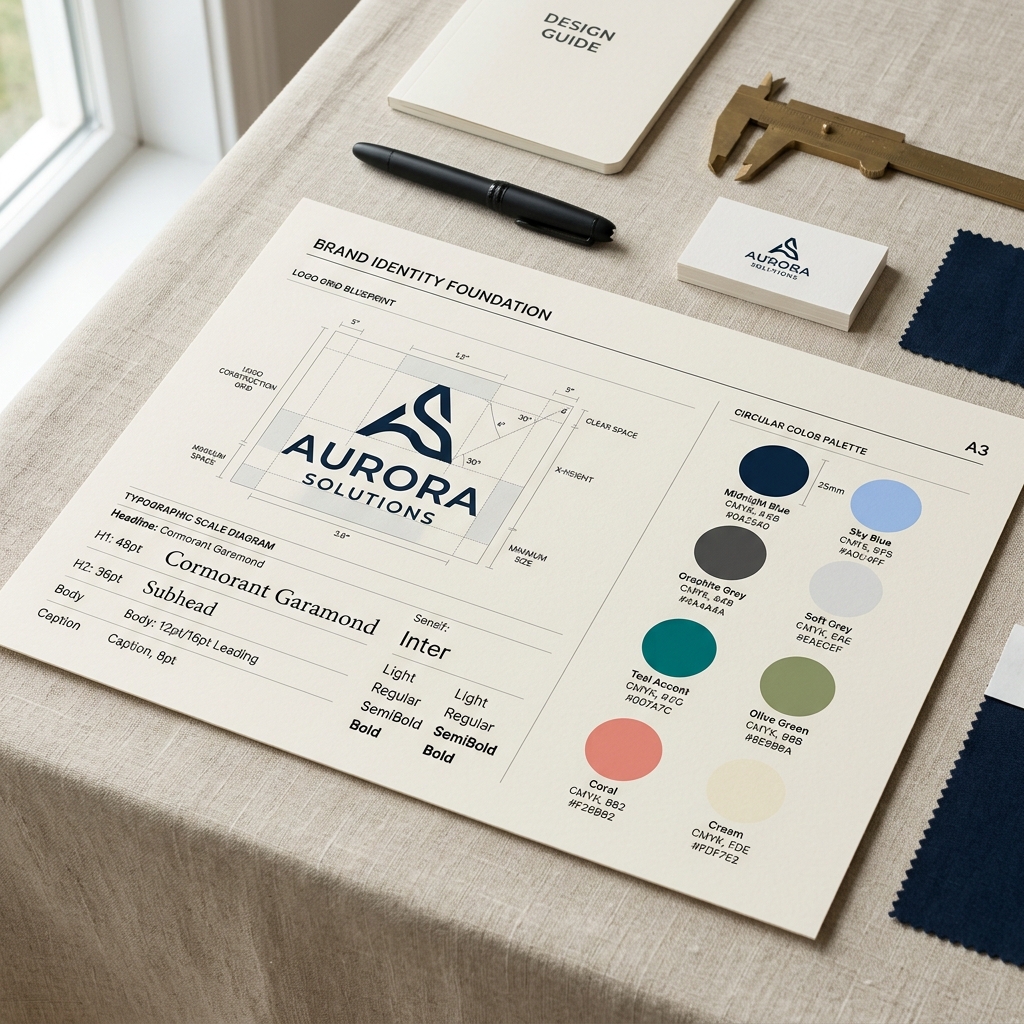
A timeless logo is engineered, not decorated. Toggle the parameters below to review our mathematical grid construction system overlays.
From strategic discovery to clean vector exports, explore the steps NITIX Digital Co. executes to craft timeless marks.
We run strategy discovery sessions to understand company core values, market goals, demographics, and trust parameters.
We perform an audit of competitor visual patterns, colors, and icons to find empty positioning channels.
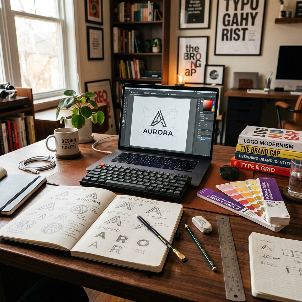
Our design team sketches hundreds of marks by hand in journals, exploring abstract shapes, letters, and balances.
We select the top 3 conceptual directions. Each is rendered in high-resolution vector and presented on mockups.
We refine the approved concept. Every line, circle radius, and typography coordinate is mathematically constructed using grids.
We test the refined mark across black, white, gray backdrops, and verify silhouette clarity down to 16px screen scale.
We export the clean vector curves, closing nodes, clearing overlapping strokes, and configuring swatches.
We bundle all source formats, print files, guidelines into a shared drive and transfer commercial copyrights.
Detailed look inside logo commissions, mapping design thinking, geometric grid construction, and multi-channel applications.
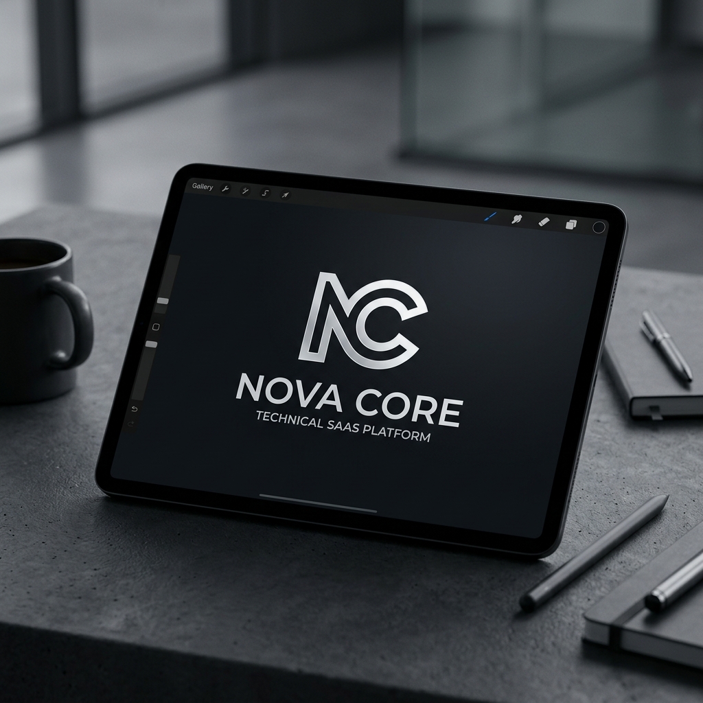
Nova Core needed a corporate brand mark that commands tech authority, avoiding typical cloud shapes while emphasizing isometric stability.
We researched isometric grids and constructed a geometric monogram fusing the letter N and a core node center, representing data structure.
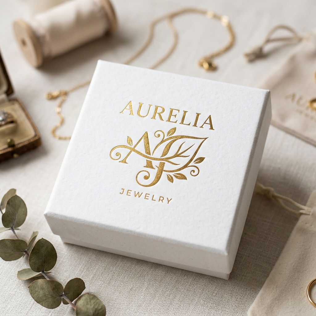
Aurelia sought to position themselves as an organic luxury studio. They required a monogram that translates craftsmanship and high quality.
We utilized the Golden Ratio spiral (Fibonacci curves) to construct a gold leaf abstract monogram, pairing with custom-designed serifs.
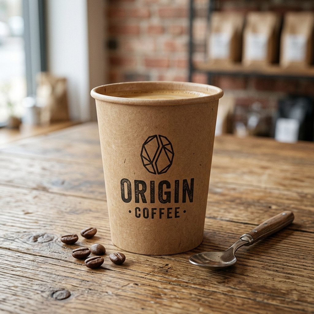
Origin Coffee required a raw, rustic seal mark that connects with local sourcing and artisanal craft while remaining highly reproducible on cups.
We researched woodcut textures and designed a concentric circular seal locking a geometric coffee branch monogram inside.
A logo is never viewed in isolation. Hover over the cards below to see how our marks perform across real touchpoints, preserving consistency.
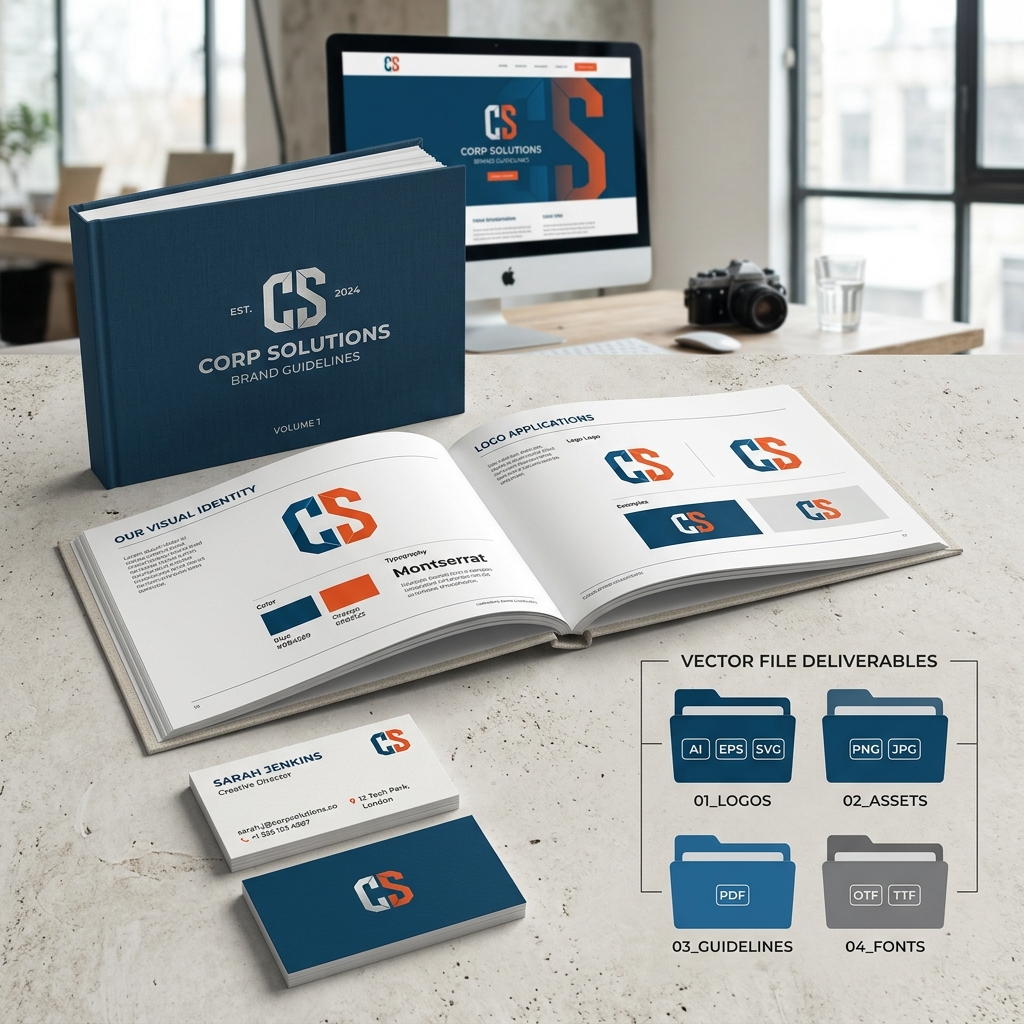
We deliver a complete corporate logo assets package structured for developers, designers, and printers.
We reject automated generators and cheap templates. Explore how our custom craft compares to standard market designers.
We chart competitive visual environments before sketching any lines. Your logo is built to command positioning channels rather than copy trends.
Every curve intersection, circle radius, and typography kerning is mathematically locked, preventing visual skews or uneven balances.
We transfer full intellectual and commercial copyright rights directly to you. Since our marks are built from scratch, they are trademark-ready.
Frequently asked tactical and strategic questions regarding process, vector files, copyrights, and custom licensing.
A custom logo project takes 4 to 6 weeks. This includes strategic discovery, sketches, geometric overlays, concept refinement, scale tests, and master file exporting.
You receive AI source files, EPS print-ready vectors, SVG web codes, PDFs, high-res JPEGs & PNGs, favicon packages, and brand usage sheets.
Vector artwork uses mathematical coordinate formulas (points, arcs) instead of pixels. This allows infinite scale without blurring or pixelating.
Full commercial copyrights and intellectual ownership transfer to your firm upon project payment completion. NITIX Digital Co. retains only portfolio display rights.
Yes. We specialize in mark evolution. We retain visual characteristics of high-equity legacy marks while modernizing their geometry proportions.
A logo is the single visual anchor mark. A brand identity is the complete system surrounding it: color codes, typographic scales, packaging templates, and corporate guidelines.
Align with a partner to discuss your brand mark goals. We evaluate your competitive landscape and map out a structured roadmap for your visual signature.
Book Studio Strategy Call