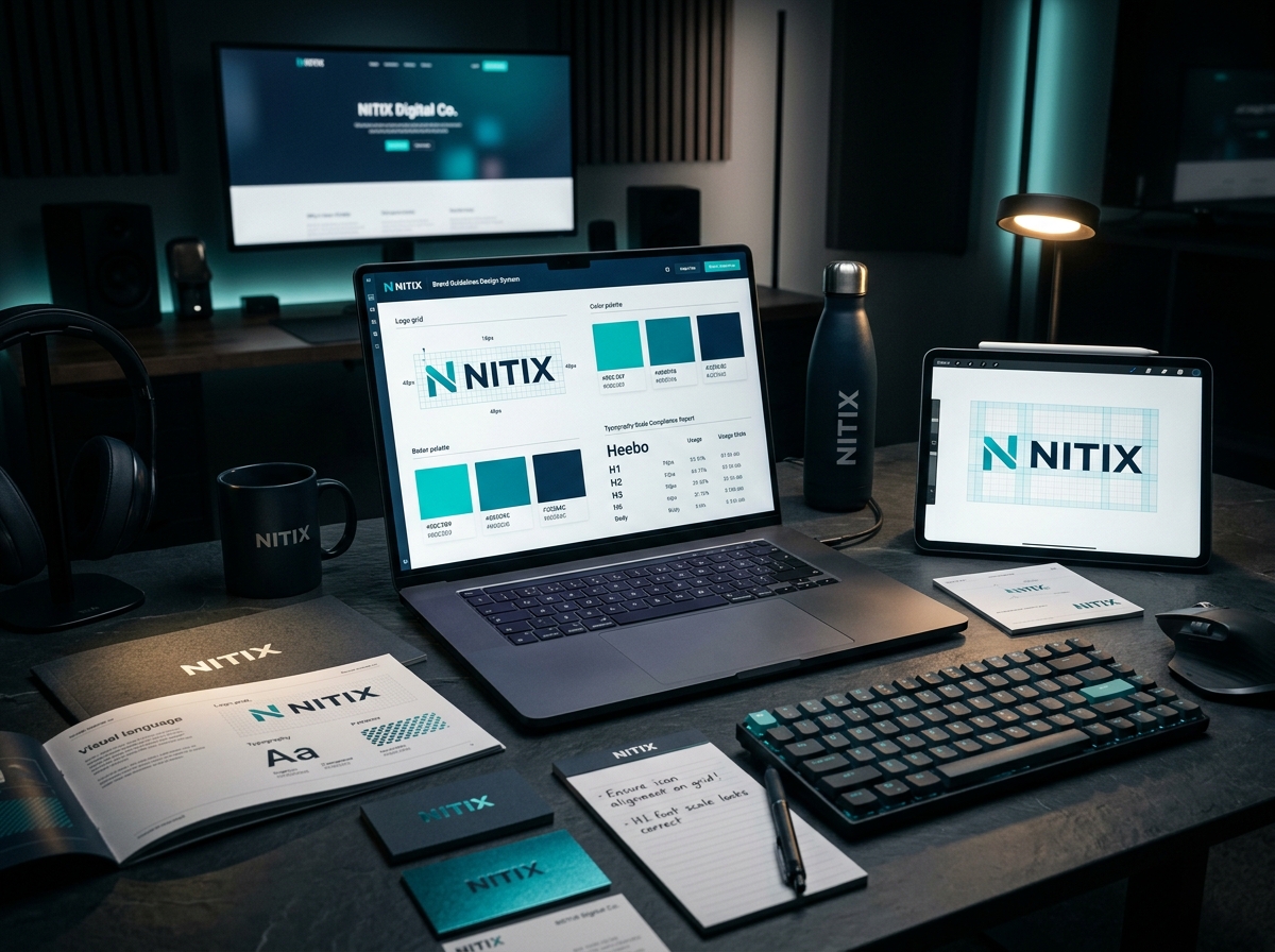
We create complete visual identity systems including logos, typography, color palettes, brand guidelines, stationery, packaging, digital assets, and every visual touchpoint your business needs to build a memorable brand.

A visual identity is not merely an artistic exercise; it is a corporate asset. We engineer systems designed to excel across three core metrics.
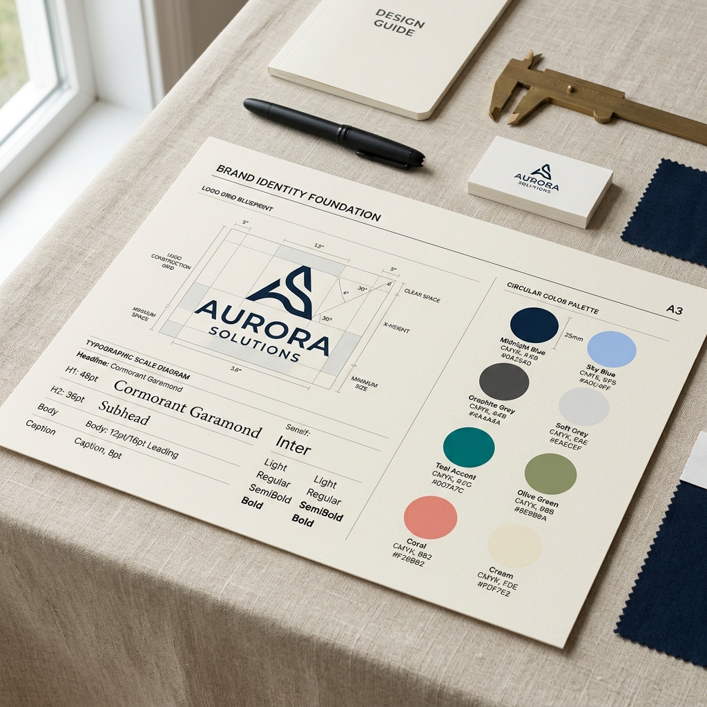
We create distinct visual marks and typography pairings that stand out in crowded markets. Your brand will be recognized in a fraction of a second, even without the name showing.
An identity only works if it is executed uniformly. We construct flexible design grids and rule systems that translate perfectly across digital, print, and physical mediums.
By anchoring design concepts in human psychology and business strategy, we build emotional associations that keep your business top-of-mind for repeat custom.
A professional brand identity is an interconnected web of design systems. Selecting any component below details its exact role and standards.
We do not just design a static icon. We build a comprehensive mark system including the primary logotype, a responsive secondary mark, monogram variants, and favicon iterations engineered to scale from massive billboard prints down to smart-watch notifications.
Typography is the voice of your text. We define precise font hierarchies using complementary combinations, outlining font weights, kerning configurations, letter spacing rules, and line-height formulas for digital interfaces and physical prints.
Color is the quickest way to convey mood and value. We map out primary brand tones, secondary supportive shades, neutral canvas colors, and semantic status indicators, checking contrast scores and calibrating values across Pantone, CMYK, RGB, and Web Hex.
Unique visual icons designed on a custom grid baseline. Consistent stroke weights, corner radius constraints, and geometry ensure icons look cohesive across your product sheets, website, apps, and presentation decks.
Patterns act as subtle brand signatures. We engineer repeating vector grids, textures, and geometric overlays that can be applied to packaging paper, envelope interiors, website headers, or corporate event backgrounds to create depth.
We document image direction parameters including filter tones, lighting styles, color saturation rules, depth of field settings, and framing structures. This ensures that any photographer or editor produces visual assets that match NITIX Digital Co. standards.
If your brand uses illustrations, consistency is critical. We establish flat vector guidelines, hand-drawn outline styles, color percentage allocation limits, and isometric design grids so all illustrations belong to the same visual language.
A brand is not only seen; it is heard. We formulate copywriting parameters defining personality traits (e.g. authoritative but empathetic), editorial writing examples, word lists to use or avoid, and grammar rules.
A comprehensive checklist of print, digital, and physical collateral we craft to ensure your brand's touchpoints are unified.
The visual anchor of your corporate identity, engineered for responsive sizing and horizontal/vertical variations.
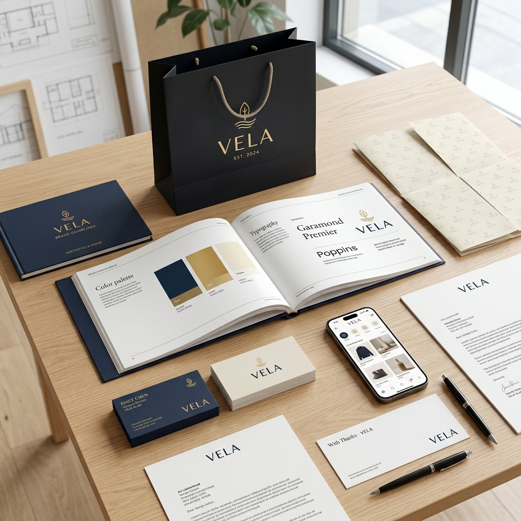
A premium corporate brand extends far beyond guidelines. We map, design, and govern every customer touchpoint across digital, physical, and sensory channels to ensure absolute consistency.
Defining competitive positioning, value proposition, and customer avatars.
Toggle between the three distinct visual styles below to see how typography, colors, buttons, and elements simultaneously update in real time.
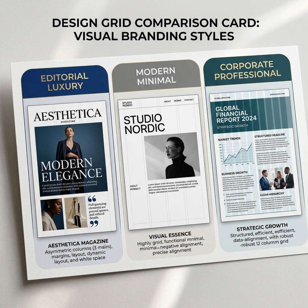
We approach visual identity with mathematical rigor and strategic strategy. This is our timeline to build your corporate visual system.
We review your corporate targets, conduct internal stakeholder interviews, and align project parameters to map out the brand direction.
We audit competitors to map their typography choices, color models, and logo structures, identifying visual white space for positioning.
Our visual directors sketch hundreds of raw monogram concepts, icon symbols, and custom wordmarks on grid paper to find the core mark.
We vectorize the strongest concepts, aligning symbols inside precise geometric bounds and testing typography pairings.
We calibrate our designs on strict geometric gridlines, ensuring perfect curves, angles, proportions, and scalability parameters.
We roll out the brand mark across secondary components: customizing iconography systems, generating vector patterns, and selecting photographic styles.
We document all guidelines including spacing rules, typography variables, color formulas (PMS, HEX, RGB), and Do's & Don'ts limitations.
We output vector print files and digital assets, hosting them in a cloud style directory for immediate team and reseller access.
Explore our premium editorial brand visual layouts. We only build bespoke, highly cohesive visual identities.
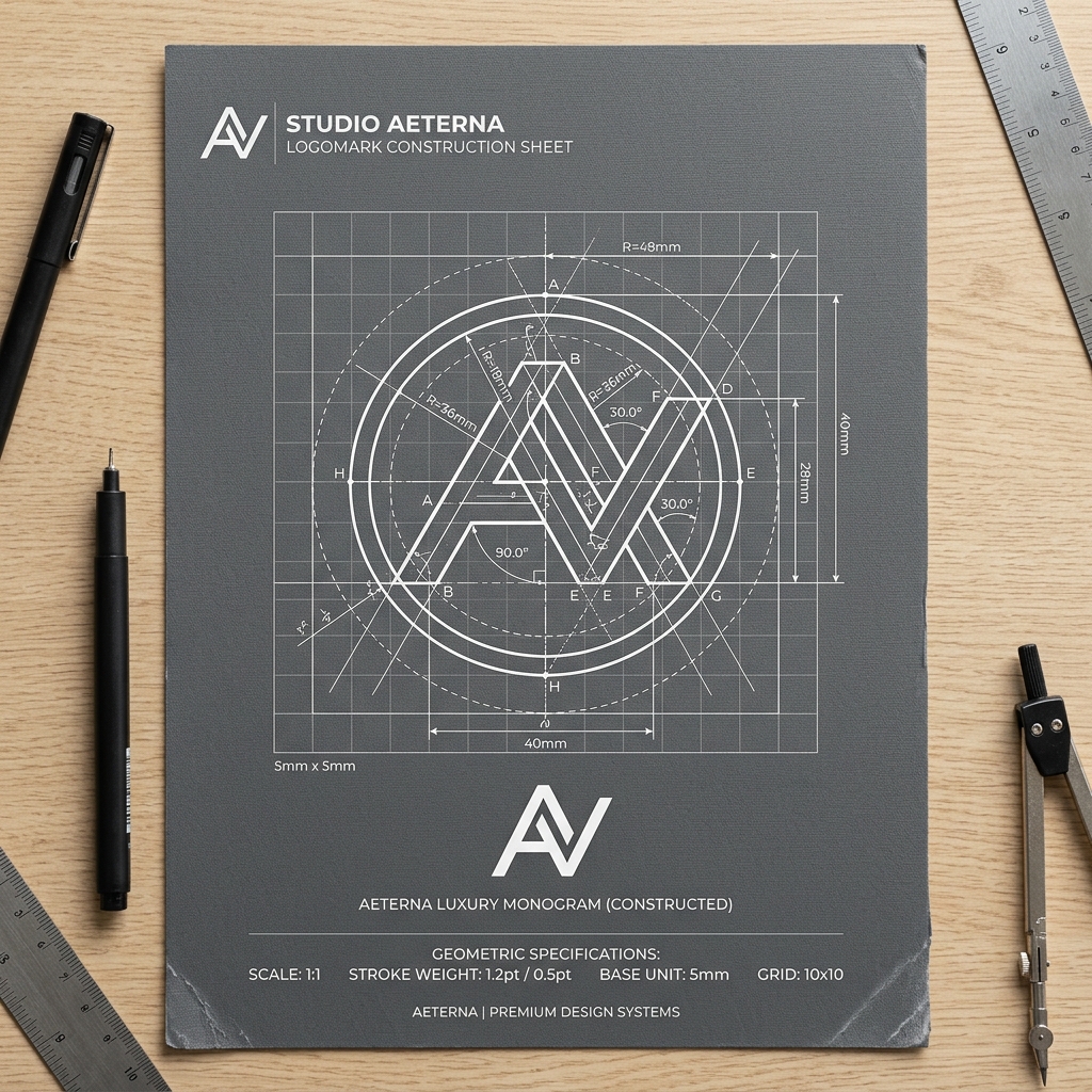
Responsive vector construction layout
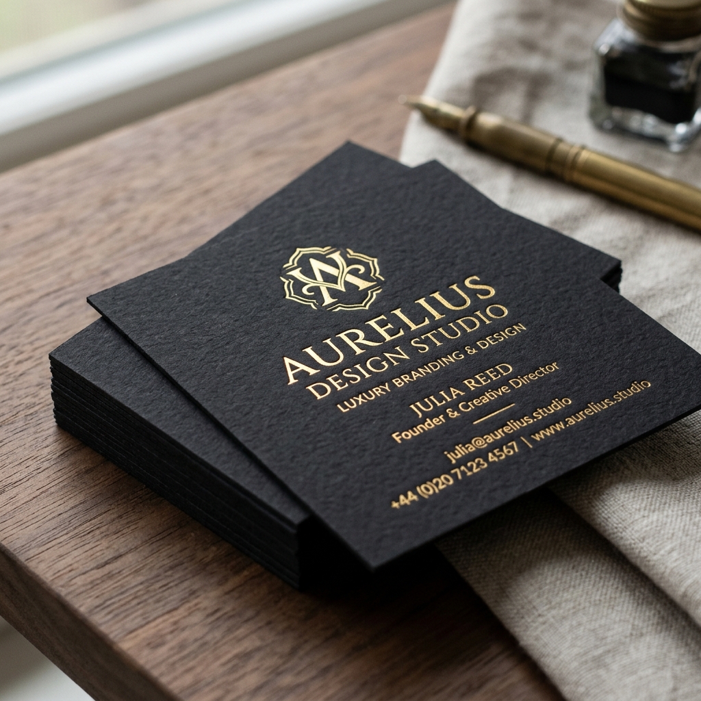
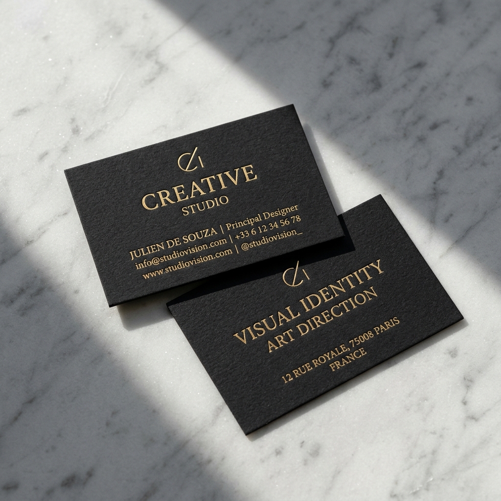
Pantone solid black & debossed gold foil
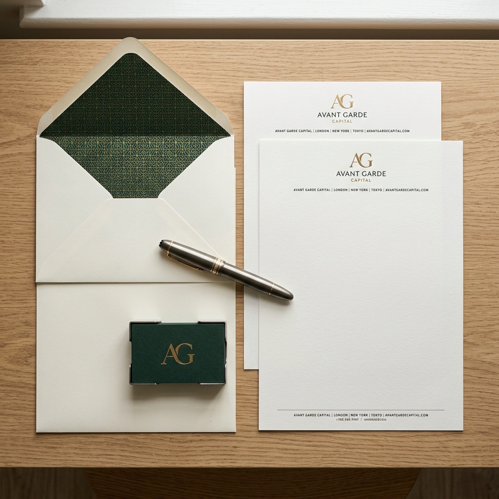
Consistent header margins & typography grids

Spot UV brand patterns & structural design
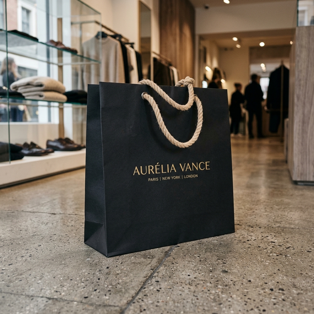
Embossed monogram on kraft board paper
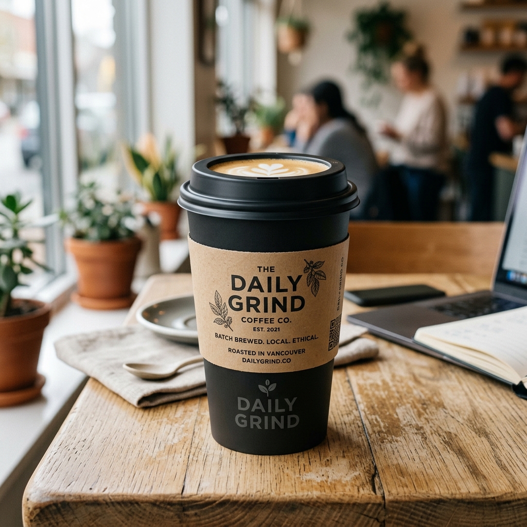
Recycled matte sleeves with contrast logo marks
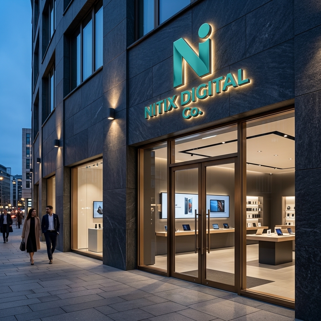
Dimensional metal logo signs on dark wood panels
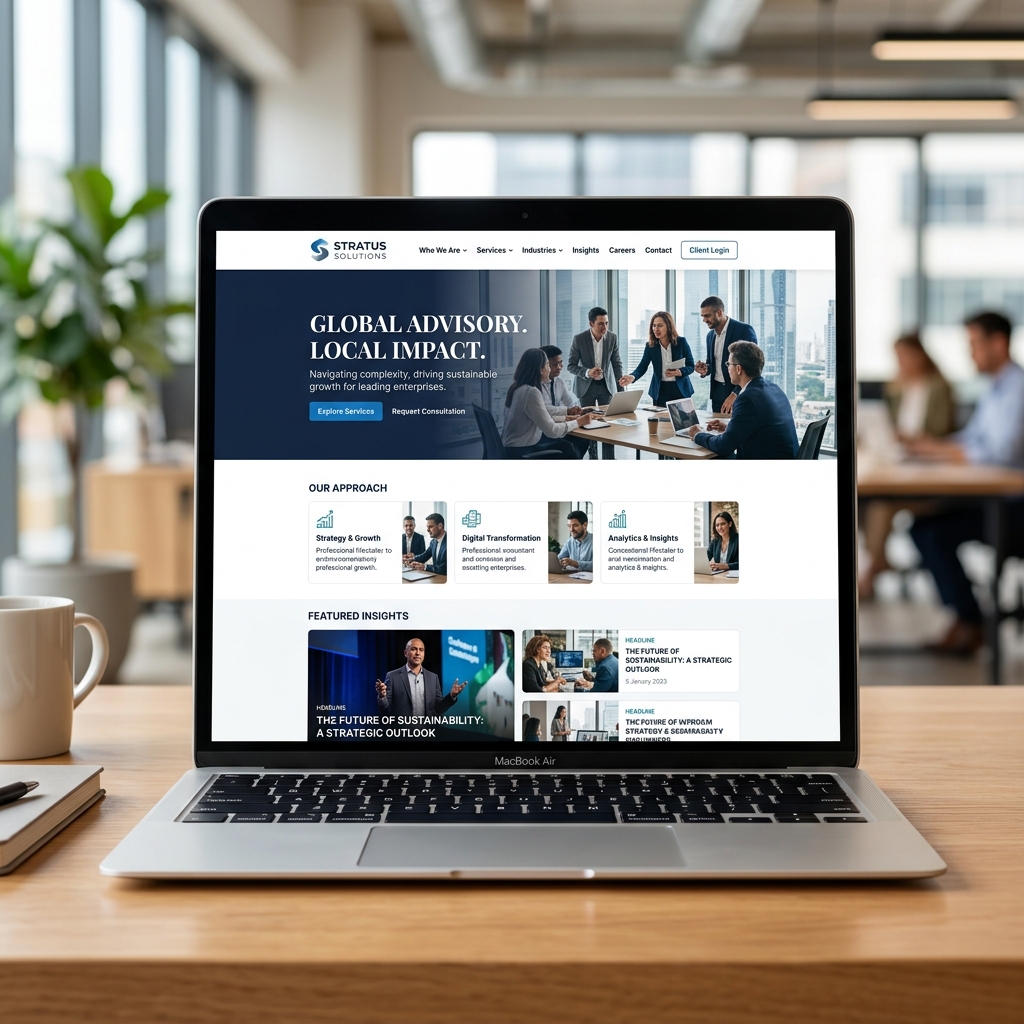
Responsive CSS typography & color application
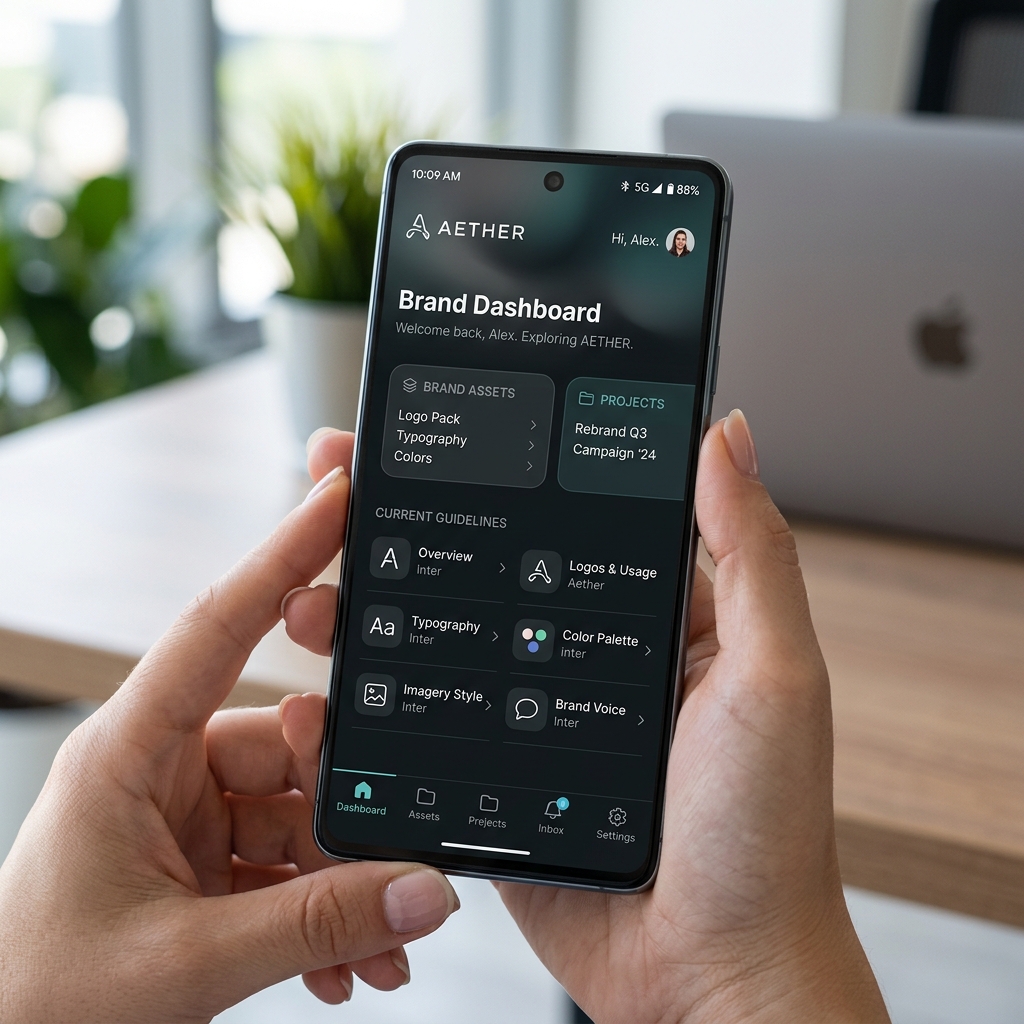
Consistent custom typography & logo favicons
Click through the corporate style book chapters below to see how rules and guidelines are documented for internal teams and vendors.
To preserve visual integrity, the brand mark must have an exclusion zone equal to the height of the primary monogram letter 'W' on all sides. Do not scale below 16px wide in digital or 12mm in print environments.
Our primary palette consists of NITIX Digital Co. Charcoal (PMS 426 C) and NITIX Digital Co. Sunset (PMS 171 C). Contrast ratios must satisfy WCAG AA standards (4.5:1 minimum contrast score for normal text assets).
Headings must use Playfair Display Bold with negative letter spacing configured (-1.5px). Body text uses Inter Regular with a line height multiplier of 1.65. Monospace is reserved for labels.
All icons are drawn on a 24x24 pixel grid. Stroke widths are configured to exactly 2px, and rounded corner boundaries use a radius of 2px. All icons use our primary brand colors.
Marketing layouts must adhere to standard margins: 30px on desktop viewports and 15px on mobile viewports. Columns are aligned to a responsive grid system to maintain visual balance.
DO: Use the primary brand colors. DON'T: Apply drop shadows to the logo mark, warp or stretch typography curves, outline solid vector marks, or change color assignments outside guidelines.
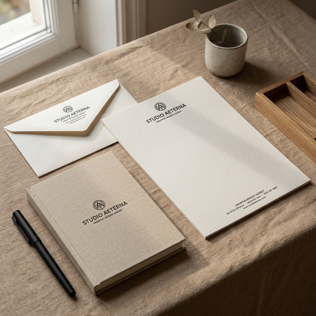
Hover over each application card below to understand how identity principles apply and adapt across physical and digital mediums.

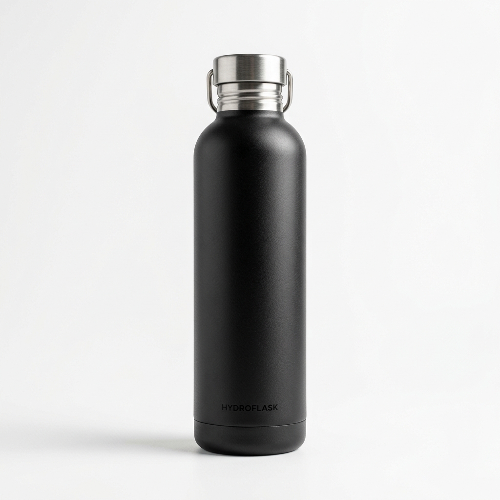
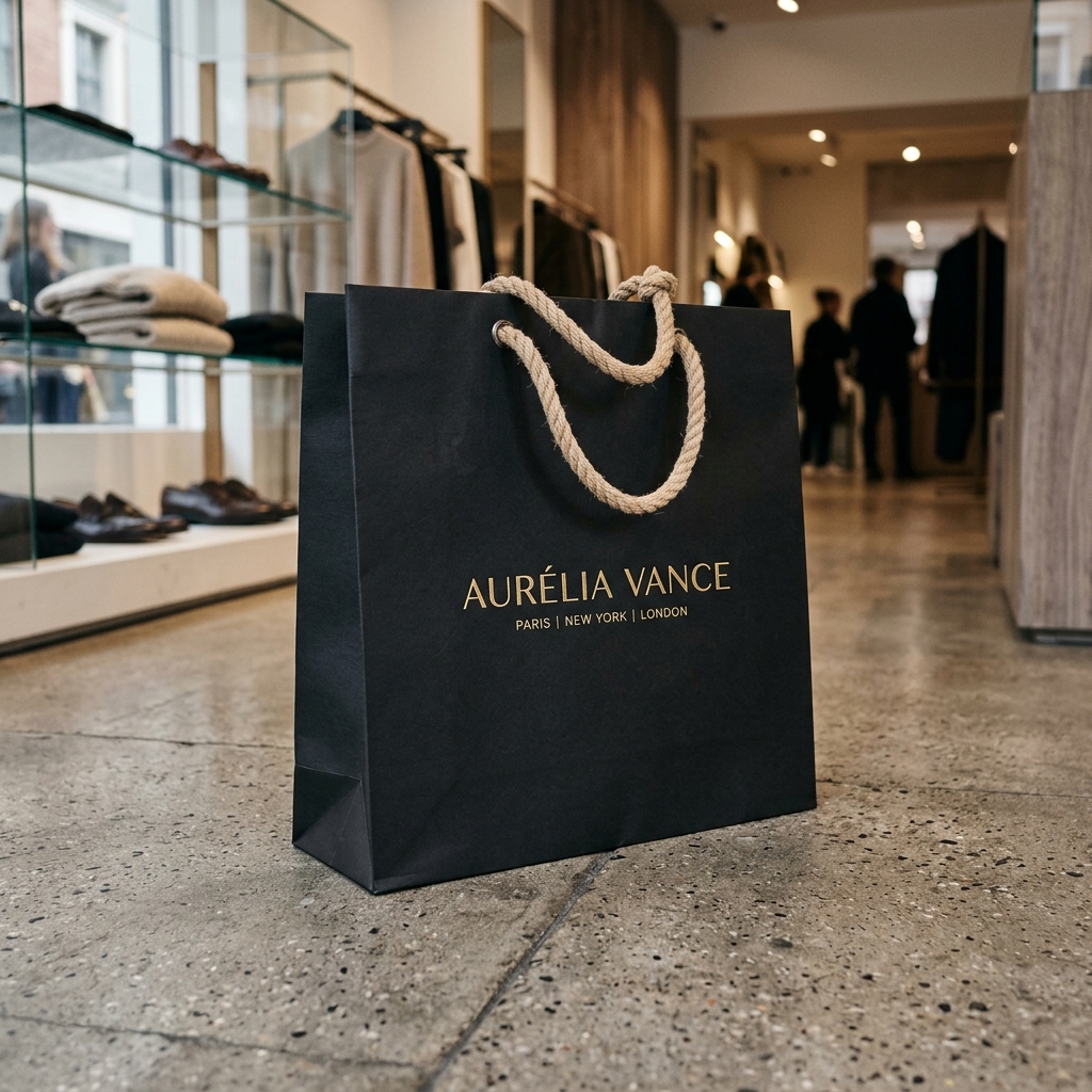

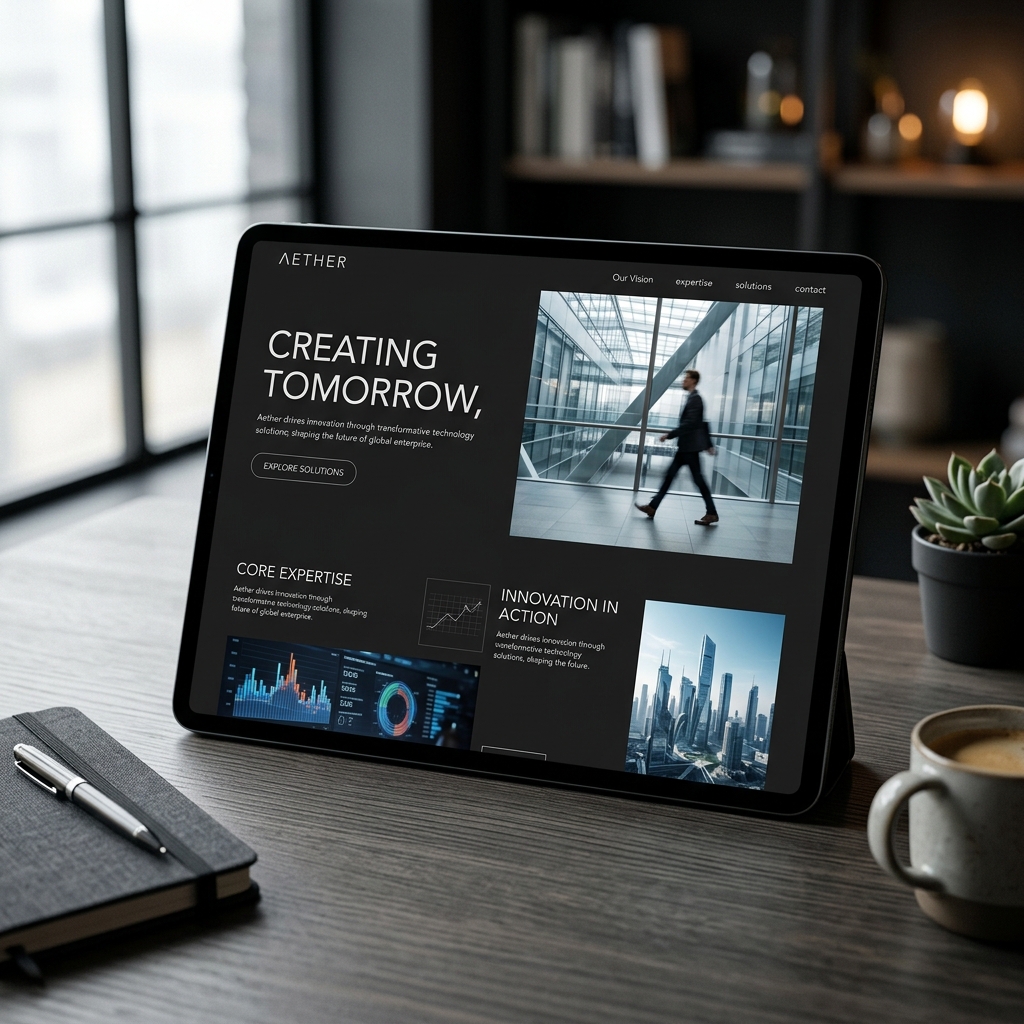

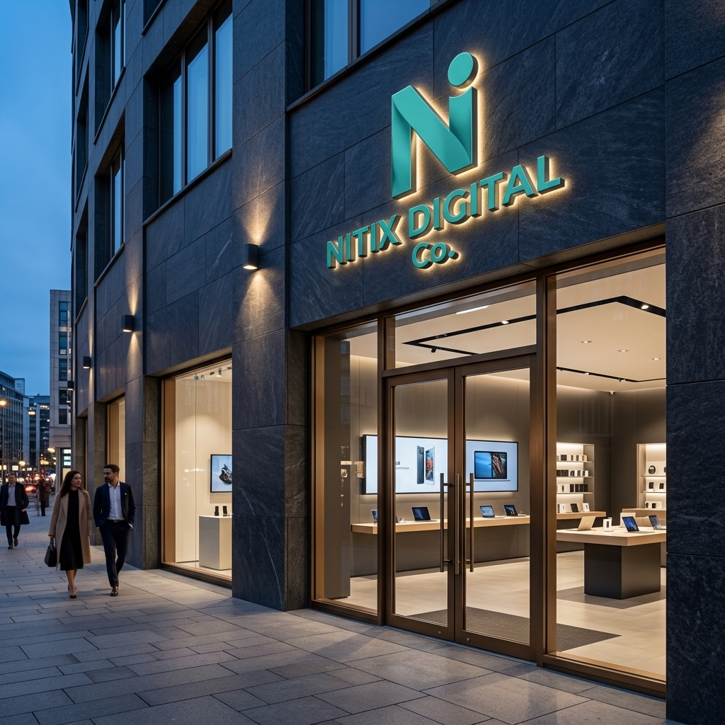
We resolve industry-specific positioning challenges to establish brand credibility across diverse markets.

Capturing shelf attention in high-noise visual environments and driving emotional repeat purchases through packaging storytelling.

Establishing feelings of luxury, heritage, quality authenticity, and bespoke craftsmanship through minimalist, tactile layouts.
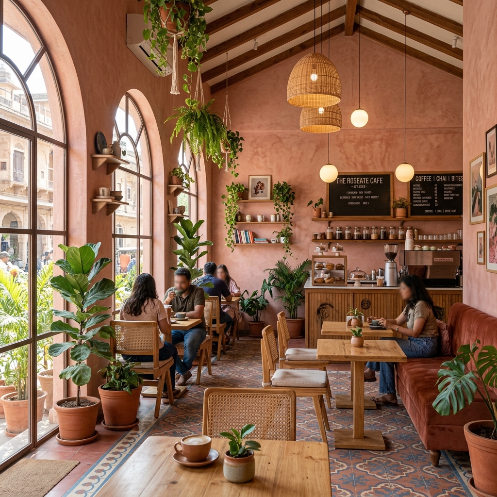
Creating welcoming spatial designs, menus, signage, and uniforms that represent warm premium services.

Building high trust, institutional reliability, accessibility, and human-centric empathy using soft tones.

Positioning complex technical products as global industrial solutions with clean value alignment.

Conveying architectural rarity, lifestyle authority, and solid investments through clean brochures and signs.

Promoting academic heritage, innovation, and global student community using traditional emblems and modern layouts.
We reject simple visual templates. We approach branding from a professional design studio perspective, connecting design directly to positioning.
Have questions about visual brand identity systems? Here are answers to our most common client inquiries.
Ready to build a premium, memorable visual system? Fill out our studio questionnaire below, and our creative director will connect with you within 24 hours.