We design, codify, and document institutional-grade brand standards manuals. Instead of loose templates or ignored PDF folders, we establish comprehensive visual governance systems that ensure absolute design consistency across all digital, packaging, print, and physical touchpoints.
Request Standards Audit
A complete Brand Book leaves no room for creative guesswork. We document every dimension, color space, and copy asset to enforce cross-departmental alignment.
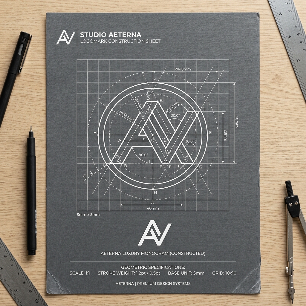
Clearspace rules, grid proportions, size limits, responsive symbol forms, secondary lockups, and strict rules for unacceptable modifications.
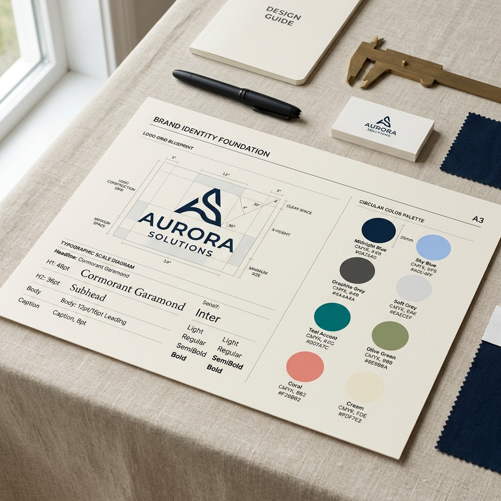
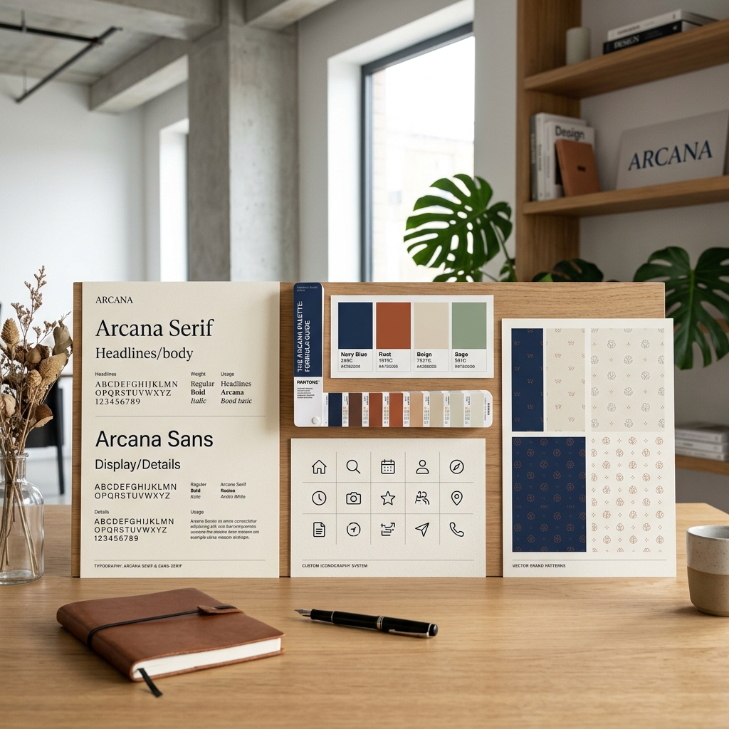
Primary and secondary font pairings, tracking and letter-spacing specifications, responsive mobile overrides, and text line-height definitions.
Primary, secondary, and editorial neutral palettes mapped across HEX, CMYK, RGB, and Pantone matching tables with contrast accessibility ratings.
Brand voice adjectives, editorial rules, copy structure guides, vocabulary standards, and capitalization schemas for sales and product interfaces.
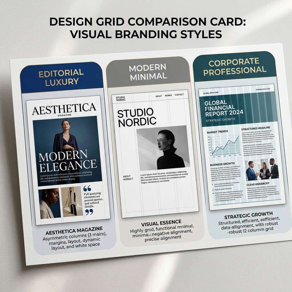
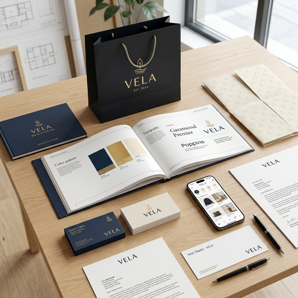
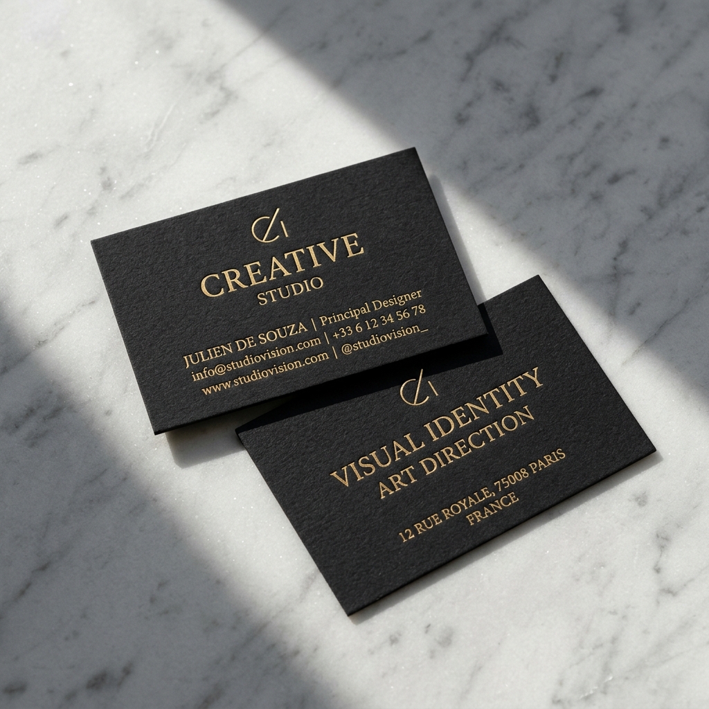
Grid layouts, paper weights, margins, and finishing standards for business cards, letterheads, presentation decks, and physical envelopes.
Responsive website headers, mobile app UI grid columns, social media template systems, icon grids, and email design layout rules.
Without strict guidelines, your brand identity slowly decays across channels. Here is how visual standards prevent fragmentation.

We codify strict geometry bounds and exclusion zones to secure the visual integrity of your primary brand assets across all digital and print applications.
Every curve, circular radius, and anchor point of the logomark is mathematically mapped to a strict layout grid. This ensures pixel-perfect sharpness and identical symmetry whether rendered on a mobile favicon or a giant physical billboard.
An invisible exclusion perimeter (equal to 50% of the logomark's width) is enforced around the entire logo structure. No other graphics, text elements, or page borders can intrude into this zone, ensuring visual dominance and legibility.
Strict structural bounds prohibit scaling distortion, unapproved color changes, drop shadows, or rotations. Keeping strict legal rules on logo representation safeguards the brand capital globally.
We specify primary and secondary fonts with strict tracking, weight pairing, and responsive sizing ratios. Click the toggle to review viewport hierarchies.
Click a color card to select it and view complete color-matching parameters, including WCAG accessibility contrast scores.
This color code complies with B2B accessibility guidelines. NITIX Digital Co. verifies contrast on all background elements to secure AA/AAA readability.
See how brand standards translate into business applications. Click the tabs below to view layouts.

We do not just deliver a static PDF guide. NITIX Digital Co. ships a complete ecosystem of source design files, digital assets, and guidelines databases.
| Documentation Pillar | What is Documented & Delivered | Format / Platform |
|---|---|---|
| Visual Identity | Vector master files, sub-brand systems, responsive symbol sets, logo clearspace definitions, layout guides. | Figma / SVG |
| Typography Matrix | Font files, optical hierarchy configurations, desktop/mobile line-height specifications, web-font pairing rules. | OTF / WOFF2 |
| Digital Components | Social media profile layouts, header banner guides, LinkedIn templates, Instagram post guidelines. | Figma Libraries |
| Print Collateral | Print-ready vector stationery templates, layouts for business cards, letterheads, invoice grids. | Adobe Illustrator |
| Physical & Spatial | Architectural signage specs, environmental branding grid systems, exterior signage scaling rules. | PDF / CAD Specs |
We build brand books by compiling, testing, and systemizing existing assets into a unified governance document.
We ingest your existing logos, collateral, fonts, and presentations to isolate inconsistent uses and find alignment gaps.
We build mathematical construction guides for your logo symbols, establish clearspaces, and define typography scales.
We test color conversions across Pantone, HEX, CMYK, and RGB values while verifying digital accessibility ratios.
We write the rules, guidelines, vocabulary lists, tone matrices, print specifications, and templates into an editorial manual.
We deliver printed manuals, interactive PDF databases, vector asset kits, and connected Figma library structures.
Are your marketing assets aligned with your logo identity? Our design team will manually review your website, social graphics, and sales presentations to build an actionable path for standardization.
Review answers to commonly asked questions about our Brand Guidelines & Brand Book deliverables.
A Brand Book (or Brand Standards Manual) is a central governance document that records typography scales, color codes, logo clearspaces, templates, and copy rules. It ensures that in-house teams, freelancers, and external advertising agencies design visual content that remains perfectly consistent, preserving your visual capital.
We deliver an interactive PDF manual, print-ready letterheads and card vector files in Adobe Illustrator, clean SVG logo libraries, connected Figma libraries, and local typography font files (OTF and WOFF2) ready for immediate deployment.
We verify and map color systems across all color spaces: RGB and HEX for web displays, CMYK for print processing, and Pantone values for industrial material manufacturing. Every color choice is stress-tested against WCAG 2.1 accessibility benchmarks to guarantee AA or AAA contrast scores.
Yes. We build guidelines using modular grid architectures. If you add secondary product lines, launch new sub-brands, or release new templates, the rules can be updated inside the master files and recompiled without breaking the existing core system.